Case study: TIAA retirement planning tool
How I overhauled a digital experience to help employees save for their future
Overview
The Problem: TIAA’s old retirement tool, the Retirement Advice Solution (RAS), wasn’t cutting it—users found it clunky, confusing, and just plain hard to use.
The Solution: We rebuilt it from the ground up as the Retirement Journey Planner (RJP), with a fresh design, jargon-free educational, content, and a user-first approach.
The Result: A sleek, easy-to-use tool that helps people confidently plan for their dream retirement.
👉 Keep reading to see how we turned a struggling tool into a success.
What we set out to do
Here’s the big picture:
Client: TIAA
The mission: Redesign their retirement tool to be simpler, more engaging, and (finally) helpful.
The tool: We took the old Retirement Advice Solution (RAS) and reimagined it as the Retirement Journey Planner (RJP).
The goal: Help users create a clear plan for their retirement based on their needs, goals, and investment style.
The challenge: RAS wasn’t meeting user expectations, and it showed—metrics were down across the board.
My role
As the lead content strategist, I made sure the words and structure of RJP worked for users. That meant:
Crafting clear, helpful content that simplified tricky financial topics.
Collaborating with UX designers, product managers, and stakeholders to make sure content fit seamlessly into the user experience.
Making sure every part of the tool—from onboarding to results—felt intuitive and easy to follow.
Team effort
I worked closely with:
UX designers: They took charge of layout, flow, and visuals.
Product managers: They made sure the tool met both user and business needs.
Stakeholders: They kept us aligned with TIAA’s big-picture goals.
How we tackled it
We didn’t just wing it. Here’s what went into our strategy:
Competitive audit: We checked out what other retirement tools were doing—what worked, what didn’t—and used those insights to shape our vision.
User research: We talked to actual users to find out where RAS was falling short and what they really needed.
Deep dive into RAS: We broke down the old tool, piece by piece, to figure out what to keep, what to fix, and what to completely rethink.
A peek at the user flow (add image here)
(Placeholder: Add a snapshot of a key part of the redesigned flow. This could be onboarding, goal-setting, or another high-impact section.)
The challenges
Placeholder: What roadblocks did we hit, and how did we overcome them? For example, balancing simplicity with financial accuracy or dealing with stakeholder feedback.
The results
Placeholder: What changed? Include any metrics (like engagement or completion rates) and user feedback that shows the impact.
Why it matters
This project was a great reminder that great content is just as important as great design. By focusing on what users actually need and making every piece of content work harder, we turned a frustrating tool into one that’s helpful, clear, and even enjoyable to use.
————————————————————————
SCHWAB STUFF FOR REFERENCE BEFORE FINALIZING TIAA RJP
About the Project
In 2020, Charles Schwab, already one of the largest financial services companies in the United States, got even bigger by acquiring one of its competitors, TD Ameritrade.
As a result, 12 million TD Ameritrade clients will have their accounts and money move to Schwab. To access their accounts online at Schwab, they’ll have to create new login info.
So, how do you make millions of clients feel comfortable about a merger they didn’t sign up for? Well-strategized, well-designed UX and communications.
Project Timeline
1.5 years (January 2021 - June 2022) from kickoff to development
The Challenge
In some mergers, clients of Company A can use their same login info to access their accounts online in the newly formed or combined Company B.
But that isn’t the case with the Schwab-TD Ameritrade (referred to as TDA from this point on) merger, as each company’s username and password criteria are different. This means that all TDA clients will have to create new login info. Not ideal.
The Solution
Design a customized version of the Schwab credential creation flow specifically for TDA clients.
My Role
Content strategist and UX writer
My Tasks
Attend user-testing sessions to help identify pain points
Perform competitive audit for UX inspiration
Write UI content for TDA and Schwab platforms (the experience will bridge both) while sticking to their respective voice and tone
Develop communications strategy
Collaborate with cross-functional teams
Present concepts to, and get buy-in from, UX team and stakeholders
The Team
Designers
Researchers
Developers
QA
Business analysts
Project managers
Product owners
Stakeholders
The Process
The design-thinking process helps us understand the target audience’s needs and how to create a seamless digital experience.

Our UX team used this iterative approach to develop a flow that made it easy for users to create their Schwab login info.
Tackling this challenge requires a multi-phased approach:
Improve the existing Schwab credential creation flow, which has caused client frustration
Customize the flow for TDA clients
Create 50+ versions based on:
Timing
Creating login info before or after the transition is completeClient type
Single-client accounts vs. multi-client accounts (e.g., spouses)Platform
Desktop website, mobile site, mobile app, and more
The Flow
Use the arrows to view a slideshow of the credential creation flow, then continue below the slideshow for detailed UX decisions.


Pages 1 and 2: TDA interstitial + Schwab intro to the credential creation flow

An interstitial on TDA platforms (left) encourages clients to go to Schwab platforms (right) to create their login info.
UX thought process / key decisions
The Before image shows the leadership team’s requested content for the intro page of the flow. I thought it contained way too much content, so I worked with the designer on an alternate version — as seen in the After image. I presented this content to stakeholders and got their buy-in after sharing UX best practices, such as keeping copy as brief as possible.

Page 3: Confirm Your Identity

Before clients can create their login info, they have to confirm their identity.
UX thought process / key decisions
See the green arrows:
“Security Preferences” label in the progress stepper: Although it’s not ideal for the stepper’s content to be structured inconsistently (i.e., a mix of noun and verb phrases), we made an exception because “Choose Security Preferences” wouldn’t have fit in the design.
“ITIN” acronym: Research showed that the majority of clients aren’t familiar with ITIN (Individual Taxpayer Identification Number), so we added a helpful infotip. See the After image.
“Date of birth” field formatting: Originally, the proper date format wasn’t included with the field label. Following UX best practices, we added the date format to prevent clients from guessing — and to minimize the chances of an error scenario.

Page 4: Create Login ID and Password

UX thought process / key decisions
Login ID criteria: Originally, users saw a list of 9 pieces of criteria. We quickly determined that was overwhelming to the user, so we reduced the list to 3 items (see green arrow) - especially since most of the criteria was highly unlikely to cause an issue (e.g., Login ID cannot be more than 50 characters).
‘Eye’ icon in the ‘New password’ field: We added this to give the user a chance to see if they have mistyped their password before continuing to the next page.
Page 5: Choose Login Security Preferences

UX thought process / key decisions
“2-step verification” terminology: Research showed that this security term was most understood by users compared to others such as “2-factor authentication” or “multi-step authentication”.
Tooltip: We also added a tooltip for those unfamiliar with the 2-step verification concept in general. See the After image.
Page 6: Choose How to Get Your Security Code
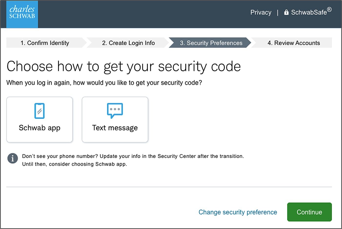
UX thought process / key decisions
Schwab app identity verification method: The Schwab Mobile app originally didn’t have this feature—tapping a push notification to confirm your identity when trying to log in. This was a glaring feature gap compared to TDA Mobile. After the acquisition, adding this verification method in Schwab Mobile was prioritized and included as a part of the credential creation flow.
“Don’t see your phone number?” tooltip: When users select the “text message” method, a modal shows them phone numbers they had on file at TDA. The tooltip informs them how to add a number if needed.
Page 7: Trust This Device

UX thought process / key decisions
Shortened body copy: “A trusted device is one that you use frequently, like your own computer or mobile phone.” was a much abbreviated version of the stakeholders’ requested content, which was twice the length. I rewrote the content to be much briefer and conversational.
Card copy: User testing revealed that many clients weren’t sure what to expect if they were to select “Yes, trust …” or “No, don’t trust …”. So, we added brief subcopy under each card’s title to help avoid any confusion.
Page 8: ‘Success’ page

UX thought process / key decisions
Green confirmation banner: In early iterations of the flow, this page was missing the confirmation banner, which was inconsistent with other Schwab experiences when a user completed a task. We added the banner and updated the content to be more conversational compared to confirmation messaging used elsewhere on Schwab platforms, such as “You have completed [XYZ task].”
“Your Schwab login info is all set for May 30” headline: Originally, the transition date was not included in the headline. But in user testing, every client we tested and who read “Your Schwab login info is all set” expected to be able to use their newly created login right away. When in fact, they would have to wait until the transition was finalized before they could access their accounts online at Schwab. It was clear we needed to add the date in the headline, especially for clients who went through this flow and created their login info before the transition was complete.
Account transition timeline: One of the biggest acquisition-related UX challenges was figuring out how to clearly communicate milestones to clients. The timeline image seen here proved to be the clearest and most preferred by TDA clients out of a handful that were tested.
Project Recap
What Went Well
The flow’s usability score more than doubled — from 40% to 88%
No abandonment and no issues reported
What Didn’t Go Well
Sporadic rounds of stakeholder feedback led to changing UX deadlines
Inconsistent compliance approval process resulted in duplicative work
What I Learned
Schedule recurring reviews and set firm content deadlines
Educate the team about the content process much earlier, at project kickoff